Blog · 7 min read
Increase Spacing First: Make a Dyslexia Friendly Font Work

No single font fixes reading struggles tied to dyslexia. The research is consistent on this: presentation, not letterforms, drives most of the improvement. Your fastest next step is simple, increase spacing and turn on a reader mode or accessibility widget before you spend another minute font shopping. The International Dyslexia Association, peer-reviewed studies published through PMC, and the AccessWiser Team all point to the same conclusion, customization beats any single “magic” typeface.
TL;DR:
- Increasing spacing and adjusting presentation variables like size and contrast have a much larger impact on readability for dyslexic readers than switching to specialized fonts.
- Research shows that individual font choices, such as OpenDyslexic or Dyslexie, do not consistently improve passage reading and are often no better than familiar fonts like Arial or Verdana with proper spacing.
- Controlled studies attribute most of the observed reading benefits to spacing, size, and layout adjustments rather than to the letter design of font types.
- Personalization through adjustable settings and testing individual preferences yields better results than relying solely on specific dyslexia-friendly typefaces.
- Presenting options for readers to customize their reading experience respects individual differences and aligns with the strongest evidence from scientific research.
Table of Contents
- What Makes a Font Dyslexia Friendly?
- What Does the Research Actually Say About Dyslexia Fonts?
- What Settings Actually Improve Reading for Dyslexic Readers?
- OpenDyslexic, Dyslexie, Arial, and More: What Should You Actually Try?
- How Should You Test and Personalize Font Settings?
- Why We Think the Font Debate Misses the Point
- Sources
What Makes a Font Dyslexia Friendly?
Design characteristics matter, but not in the way most marketing copy suggests. A dyslexia readable typeface tends to share a handful of traits that reduce visual confusion between similar letters, though none of them work in isolation.
- Letter distinctiveness. Letters like “b,” “d,” “p,” and “q” should look clearly different from one another, not just mirror images.
- Larger x-height. Taller lowercase letters relative to the cap height give the eye more surface area to lock onto.
- Open counters. The enclosed space inside letters like “a,” “e,” and “o” should stay open rather than cramped, so shapes don’t blur together at smaller sizes.
- Low stroke contrast. Fonts where every stroke is roughly the same thickness are easier to track than ones with dramatic thick-thin variation.
- Weighted bottoms. Some accessible font styles add slightly heavier weight near the baseline, which can help anchor letters in a line of text.
Decorative flourishes work against all of this. Ligatures, true italics, and tight letter spacing shrink the visual gaps that dyslexic readers rely on to separate one letter from the next. That’s why spacing and letterforms are so tightly linked: a mediocre font with generous spacing often reads better than an elegant one crammed too close together. Familiar fonts, adjusted properly, frequently beat unfamiliar “specialist” designs for exactly this reason.
What Does the Research Actually Say About Dyslexia Fonts?
The strongest studies on this topic report modest, narrow effects, not dramatic ones. A 2022 peer-reviewed study on Dyslexie found no passage-level reading advantage over Calibri, even though letter-naming fluency showed a small improvement with Dyslexie. That distinction matters: kids read letters faster in isolation, but reading actual sentences and paragraphs, the skill that counts in school and daily life, showed no measurable gain.
Fonts marketed for dyslexia are not classified as an evidence-based intervention. The available research doesn’t support treating a specialized typeface as a substitute for structured literacy instruction.
That’s the position taken by the International Dyslexia Association, and it lines up with what OpenDyslexic and Dyslexie experiments have shown across multiple trials: mixed or null results once you look past single letters and into full passages.
Here’s the confound researchers keep running into: spacing, not letter shape, tends to explain most of the measured improvement. Studies that control for character and line spacing find the “font effect” shrinks dramatically, sometimes to nothing. Increase spacing on an ordinary font like Verdana, and you can reproduce much of the benefit people attribute to specialized designs.
The honest, balanced takeaway: fonts may help with specific tasks, like early letter-recognition exercises, for some readers. They are not a substitute for structured literacy support, and no study to date shows one typeface working reliably across a whole population.
What Settings Actually Improve Reading for Dyslexic Readers?
Presentation changes have a better track record than font swaps. Research on fonts and reading behavior recommends specific, testable adjustments:
- Size. Aim for larger font sizes than most default body text to improve readability on small screens. Eye-tracking studies tied to this range show shorter fixation durations, meaning the eye spends less time struggling on each word.
- Character spacing. Increase tracking by a moderate amount to improve readability. This change accounts for much of the observed “dyslexia font” effect in controlled studies.
- Line and paragraph spacing. Wider line-height gives the eye a clear runway back to the start of the next line, cutting down on lost place and re-reading.
- Alignment. Left-align text instead of justifying it. Justified text creates uneven word gaps that break up visual rhythm.
- Contrast. Stick with black text on a white or very light background. High contrast consistently outperforms low-contrast or colored-on-colored combinations.
Most of this is adjustable without touching a single font file. Browser zoom, a reader-mode toggle, or basic CSS properties like letter-spacing, line-height, and text-align cover nearly everything on the list above.
Pro Tip: Before changing your font, try widening line spacing on whatever you’re already reading. It’s the cheapest test you can run, and it often produces the biggest jump in comfort.
OpenDyslexic, Dyslexie, Arial, and More: What Should You Actually Try?
Every font on this list has defenders and detractors, and the honest answer is that results vary by reader.
- OpenDyslexic is free and purpose-built for dyslexia, with heavy-bottomed letters meant to prevent flipping. Study results on passage reading remain mixed, so treat it as worth trying, not a guaranteed fix.
- Dyslexie uses distinctive letterforms and slanted stems. It may help with letter-level recognition tasks, but the passage-reading research doesn’t back it as a reliable everyday upgrade.
- Arial, Verdana, and Calibri are familiar sans-serifs most people already read comfortably. With spacing adjustments applied, they frequently perform as well as or better than specialist fonts, largely because familiarity reduces the mental effort of decoding letter shapes.
- Comic Sans gets mocked constantly, but its irregular, almost handwritten letterforms genuinely help some readers distinguish characters. Monospaced fonts like Courier offer uniform character width, which some readers find easier to track line by line, at the cost of looking dense on the page.
None of these wins across the board. The right choice depends entirely on the individual reader sitting in front of the screen.
How Should You Test and Personalize Font Settings?
Testing beats guessing. Run a simple two-variable comparison instead of assuming any accessible font styles will work for you or your reader.
- Pick one passage of text and read it twice, once in your current setup and once with a single variable changed, like added letter spacing.
- Record three things each time: reading speed, number of errors or re-reads, and subjective comfort.
- Change only one variable per test. Mixing font, size, and spacing changes at once makes it impossible to know what actually helped.
Personalization consistently outperforms any single recommended font, which is exactly why visitor-facing controls matter so much on websites. Letting readers adjust font choice, size, spacing, and contrast themselves respects the fact that no two dyslexic readers process text identically. A widget-based approach, the kind AccessWiser builds into its accessibility solutions, lets site visitors dial in their own settings instead of forcing everyone into one designer’s guess at what “accessible” looks like.
Pro Tip: Test with real content from your own site or classroom, not a generic sample paragraph. Reading behavior with technical text differs from reading a novel excerpt.
Why We Think the Font Debate Misses the Point
The evidence supports a conclusion most font marketing won’t say out loud: the letterform itself is rarely the lever worth pulling first. Spacing, size, contrast, and alignment do far more work, and they cost nothing to test. That’s not a hedge, it’s what the passage-reading data actually shows, repeatedly, across multiple studies.
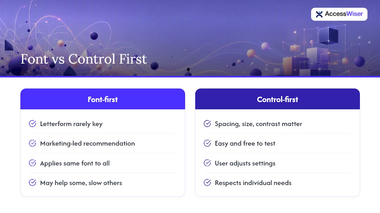
Where conventional advice falls short is treating “dyslexia font” as a category of solution rather than a starting point for experimentation. Recommending OpenDyslexic or Dyslexie to every dyslexic reader ignores that reading is deeply individual. What helps one person track a line can slow another down.
Prioritize control, not conversion. Give readers the ability to adjust their own text settings, whether that’s through browser tools, a reader mode, or a site-wide accessibility widget, before you commit to any one typeface as the answer. That approach respects the actual research instead of a marketing shortcut, and it’s the same principle AccessWiser applies when building visitor-facing display options into its accessibility program.
— The AccessWiser Team
Sources
- The effect of a specialized dyslexia font, Dyslexie, on reading rate and accuracy (PMC)
- Do special fonts help people with dyslexia? (International Dyslexia Association)
- Good fonts for dyslexia (Rello & Baeza‑Yates)
Recommended
Articles on this blog are general information about web accessibility, not legal advice. Laws change and their application depends on your specific situation — for decisions with legal consequences, consult a qualified legal professional.
Articles on this blog are general information about web accessibility, not legal advice. Laws change and their application depends on your specific situation — for decisions with legal consequences, consult a qualified legal professional.